How to Create a PERT Chart in Microsoft Excel 2007
How to Create a PERT Chart
There are actually a number of ways that you can create a PERT Chart in Excel 2007, but I’m going to walk through the steps of one of my favorite methods – one that allows a lot of flexibility while still giving a final product that looks professional and is easy to read.
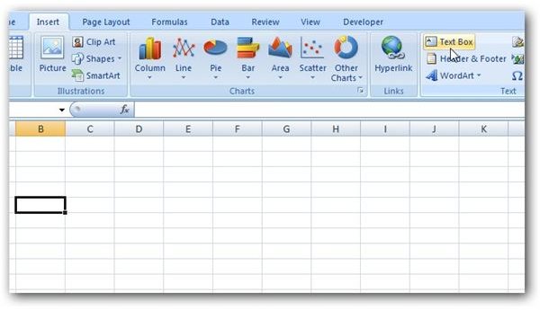
Step 1: Go to the Insert tab on the Excel ribbon and click on Text Box. (Click any image for a larger view.)
Click on the area of the spreadsheet where you want to insert the text box. You can then resize the text box by clicking and dragging any of the corners.
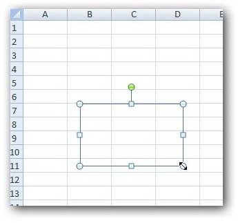
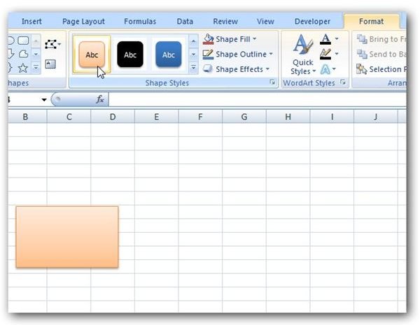
Step 2: With the text box still selected, go to the Format tab under Drawing Tools on the Excel ribbon. Either expand or scroll through the available styles in the Shape Styles category to pick one you like for the text box.
Step 3: Click on the inside of the text box and begin entering any information for a single task. Make sure to include all of the information you want displayed.
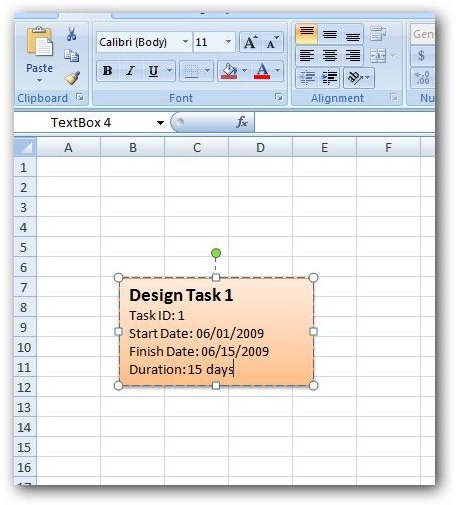
Depending on how much information you want to include, you may want to resize the text box again. Also, you can edit the font size and style from the Home tab of the Excel ribbon just as you would edit any other text. When done, click anywhere on the spreadsheet outside the text box to see how it will appear.
Step 4: To enter subsequent tasks, you can walk through Steps 1-3 again to create new text boxes. However, since the information you’re going to enter for other tasks is probably going to be in the same format as the first, it’s generally easier to just copy and paste the first text box and edit the information it contains. To do this, first make sure that the text box is selected. Then, right-click on the green circle above the text box and choose Copy.
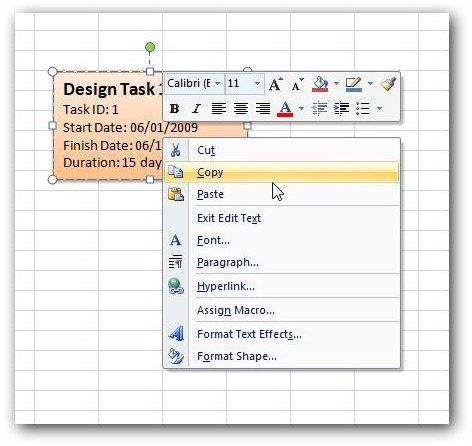
Next, right-click on the area where you want the new text box to appear and select Paste.

Click anywhere in the new text box and edit the information to reflect the next task.
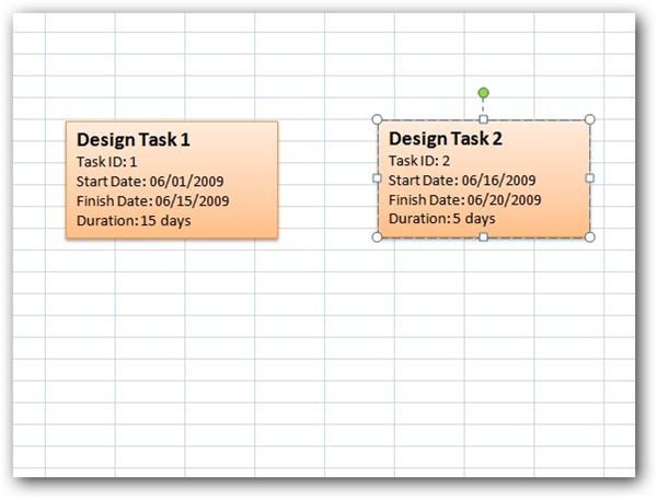
When done, click anywhere on the spreadsheet outside the text box to continue. Repeat this process for each task that you want to add.
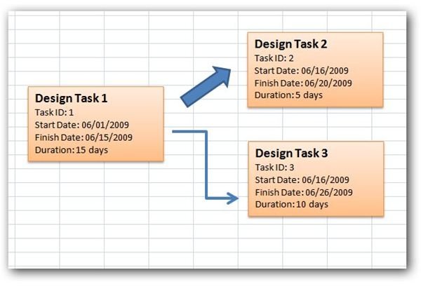
Step 5: Once you have all the task information entered into text boxes, you’ll probably want to add lines or arrows that show the flow of the PERT chart. To do this, return to the Insert tab of the Excel ribbon and click on Shapes in the Illustrations category.
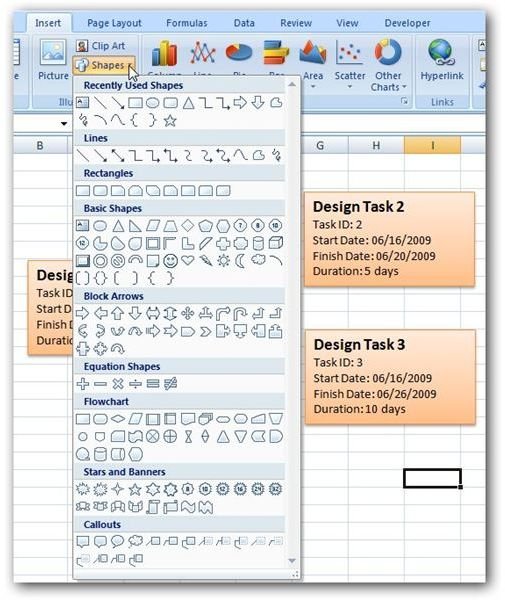
Pick any design that you want to use for the connector. For this example, I’ll choose one of the block arrows.
Next, click at the point in the spreadsheet where you want to insert the connector. Note that you’ll probably have to resize it and may even have to rotate it in order to connect one box to another. You can rotate the arrow by hovering the cursor over the green circle above the arrow until it turns into a circular shape. Then, click and drag the mouse to rotate the shape.
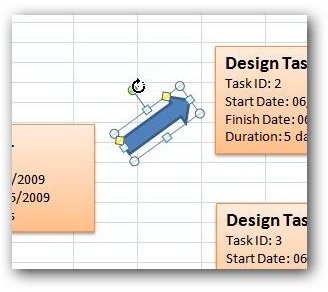
You may want to experiment with different shapes to come up with the one that looks the best for your PERT chart. The screenshot below shows a couple of different alternatives.
Additional Resources: If you’re interested in learning how to create other types of diagrams in Excel, check out this overview on Excel project management tutorials and templates. Also, if you create PERT charts on a regular basis, you may be interested in PERT Chart Expert, a project management application developed solely for the purpose of constructing PERT charts quickly and easily.
If you’re looking for sample forms and downloadable templates, check out Bright Hub’s resource guide Over 50 Free Project Management Templates and Sample Forms.
