Guide to the Various Charts and Diagrams Used in Project Management
Charts Overload!
Oh my goodness, there are many, many different types of charts and diagrams used by project managers! Do you know which chart or diagram will best benefit your project management process? What chart is best used when it comes to determining the cause of a problem in a project? What should you use when scheduling your project. Whether you’re a newbie or a seasoned project management veteran, there’s always a new chart to learn about or a new technique for creating the chart which will make your life much easier. Charts and diagrams are used during all phases of the project management process, and can help you determine the health (or likelihood of failure) of your project.
The Gantt Chart
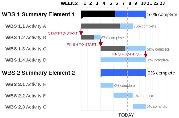
The Gantt chart is the cornerstone of project scheduling. Gantt charts depict the schedule of the project. Henry Gantt developed the Gantt chart in his 1903 work “A Graphical Daily Balance in Manufacture.” The aim of the chart was to help graphically represent what work had been done, what work had not yet been done, and what work still needed to be completed in a way that was easy to interpret. We’ve come a long way since Gantt first put forth his ideas for using the charts in management, but they are still extremely useful tools for managers.
- What is a Gantt Chart and How do I Make One?
- Learning How to Make a Gantt Chart in Excel
- Successfully Create a Gantt Chart Using Project 2007
- Using PowerPoint to Make Gantt Charts for Your Project
- The Benefits of Using a Gantt Chart
The Pareto Chart
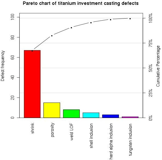
The Pareto is another chart named after the person who invented it. This chart is both a bar graph and a line graph, and it demonstrates a lot of information visually. What kind of information does the Pareto chart display? Along the left vertical axis is the frequency of a particular defined metric’s occurence. In the example to the right, it’s the frequency of defects that is depicted. Along the right vertical axis, the cumulative percentage is listed. Along the bottom is the list of things being measured in the graph.
- Understanding the Theories at Work behind the Pareto Chart
- Knowing the Right Time to Use a Pareto Chart
- Using Excel to Create a Pareto Analysis
- How to Create a Pareto Chart Using Excel
- Using a Pareto Chart in Six Sigma
Control Charts
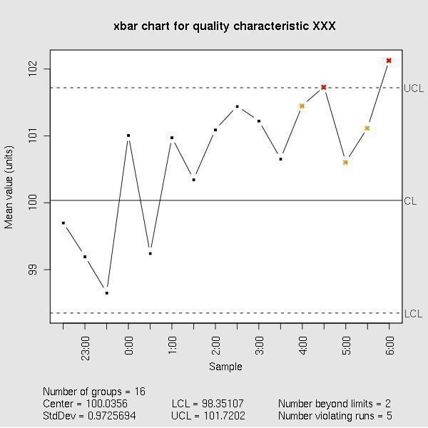
A control chart is part of a quality improvement set of tools. Control charts, also known as Shewhart charts allow those reading them to determine whether a process is effective. The control chart operates within set limits. The center line, as depicted to the right, shows the baseline for the process being measured. The chart allows project managers and team members to assess the level of variation in any given process being tracked.
- An Introduction to Control Charts and Their Functions
- Examples of a Control Chart
- Types of Control Charts for Your Projects
- Use of the Quality Control Chart in Project Management
- Forms for Project Management Control Charts
PICK Charts
PICK Charts show project managers four options for tasks depending upon what quadrant an item lies in. There are two different possible payoffs along the top - low payoff and high payoff. There are two different skill levels along the left vertical line: easy to do and hard to do. Depending upon where in the quadrant an item lies, depends on whether it should be implemented or not. PICK stands for: possible, implement, challenge, kill.
- Creating a PICK chart using Excel
- Template for Creating a PICK Chart in Publisher
- PDF for Creating a PICK Chart
SIPOC Diagram
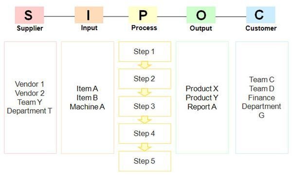
A SIPOC diagram is most frequently used during the DMAIC define phase in Six Sigma. The purpose of the SIPOC diagram is to demonstrate exactly what goes in and out of a given process. This diagram allows all stakeholders to easily view what’s involved when they are working on a quality improvement project. SIPOC is an acronym standing for: supplier, input, process, output, and customer.
- Creating a SIPOC Diagram to Use in Your Six Sigma Projects
- SIPOC Diagram Template for Excel 2007
- Excel 97-2003 Template for SIPOC Diagram Creation
- MS Publisher SIPOC Template
Fishbone Diagram
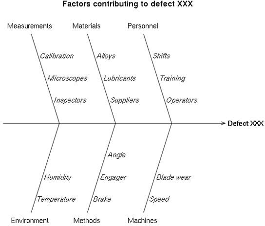
The Fishbone diagram, is also known as a cause and effect diagram or the Ishikawa diagram. This diagram allows for you to visually represent possible causes for a given problem. A line is drawn depicting the defect, and then lines shoot off demonstrating different factors that could have potentially contributed to the problem.
- Using Fishbone Diagrams to Diagnose Problems in IT
- Using a Fishbone Diagram in Your Six Sigma Processes
- Using Microsoft Excel 2007 to Create a Fishbone Diagram
- Creating a Fishbone Diagram Using Microsoft Word
- Template for Creating a Word Fishbone Diagram
- Software Available for Creating Fishbone Diagrams
Histogram
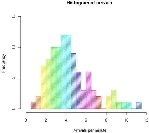
No, the histogram is not a cure for asthma. Histograms are used in project management for a variety of reasons. They are created in order to visually represent a given set of data to an audience. The histogram can be used to demonstrate how it is that project resources have been allocated, they can show profit over time, or any number of data.
- Histograms 101: What the Histogram is All About
- Learning How to Interpret the HIstogram
- All about the Bimodal Histogram
- Displaying the Resource Histogram in Project 2007
- Learning to Create the Histogram in Microsoft Excel 2007
- Creating a Six Sigma Histogram in Excel
- Which is the Better Tool the Box Plot or the Histogram?
More Charts and Diagrams
There are many more charts and diagrams used in project management. The PERT diagram shows the connection between dependencies. The work breakdown structure (WBS) shows the relationship of tasks to milestones to the main project. The responsibility assignment matrix demonstrates to project stakeholders and team members who has been assigned which tasks in a project.
- Your Guide to Using the PERT Chart for Maximum Benefit
- The Role of the WBS in the Project Management Life Cycle
- The Stakeholder Analysis Matrix
- Knowing the Right Time to Use Charts is as Important as Knowing which Chart to Use
- Creating a Precedence Diagram
- Swim Lane Diagrams Help You Illustrate Your Workflow
- Putting together a Flow Chart to Help Understand Your Gap Analysis
Charts, Diagrams, and Project Managing
Charts and diagrams are very helpful tools for keeping your project on target and for analyzing the different components of your company’s processes. Through effectively using the tools others have invented in order to make the project planning and managing process more streamlined.
References
- Histogram Image courtesy of Wikimedia Commons
- Gantt Chart image courtesy of Wikimedia Commons
- Fishbone diagram image courtesy of Wikimedia Commons
- Pareto Chart image courtesy of Wikimedia Commons
- PICK Chart image courtesy of Ginny Edwards
- Control chart image courtesy of Wikimedia Commons
